


Your DUPR Rating as a Percentile
Where Do You Rank?

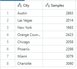
DUPR is a rating system in pickleball that gives you a reasonable measurement of your skill level. It is suspected to be similar to the ELO rating systems used by chess and e-sports but it is not known to the public exactly how DUPR is calculated. Even worse I wasn’t personally able to find a distribution of DUPR scores online to contexualize my rating as a percentile. How am I supposed to know how toxic I can be in open play if I don’t know my percentile rating? So I pulled from publicly available DUPR scores by applying a filter to the cities in the chart and scrolling down for a few minutes (strict CAPTCHA prevented scraping). While the sample might not be exhaustive, it should give a reasonable snapshot of the ratings distribution. Here are the number of samples pulled for each city. Note: These ratings are for doubles only.
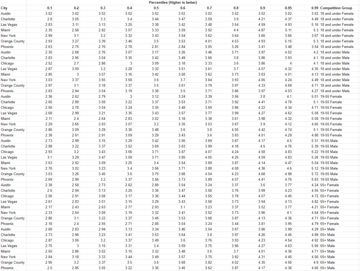
And here is the percentile chart I was able to create from the DUPR scores I pulled.

The chart above tells you based on your DUPR rating in a particular city how many people you should expect to win against in a random sample of people with DUPR accounts. In Austin, a DUPR rating of 3.29 means you're right at the median—50% of players have a lower rating, and 50% are higher. So, if your DUPR rating is 3.29, you’d win about 50% of the time if you played against a random sample of Austin players (please don’t sue me DUPR I’m so close to finding a sports betting system that works).
Interestingly, cities like Miami and Austin tend to have lower average DUPR ratings compared to places like Orange County or Charlotte. While I don’t have an explanation for this trend, it raises an interesting question about regional differences in pickleball skill levels. Here’s a KDE Plot by city.
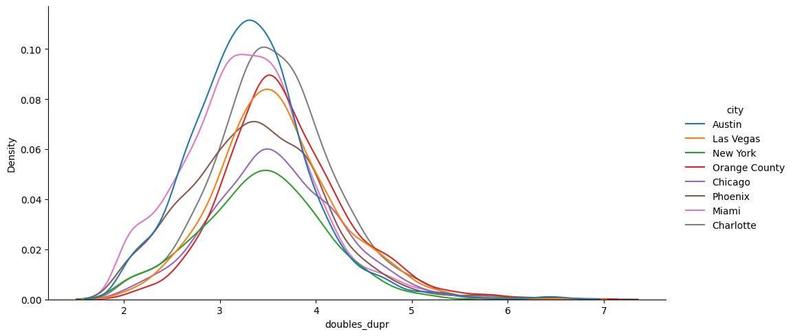
The KDE plot below shows how DUPR ratings are distributed across cities. The peak in each city's curve represents the rating range where most players are concentrated. Keep in mind, the y-axis values aren’t normalized by city—so lower peaks just mean I pulled fewer samples for that city.
Since I have the data here’s another KDE plot by age group.

The sport’s popularity seems to be concentrated among older adults — no surprises there. Here’s one more plot for each competition group.

Anyway I’m in between the 80th and 90th percentile (nice), which makes sense because I’m unemployed (lame). Where do you rank? Check out the charts above to find out.
Hey, I do similar stuff with pickle data. I'll show you mine if you show me yours? (raw data...I mean). email me plzzz? connermcnicholas@gmail.com